Kidadventures — Designing Clarity for Overwhelmed First-Time Parents
Role: Product Concept / UX Thinking / Design / Narrative
Scope: UX / App Concept / Information DesignThe Problem
As a first-time mum, finding suitable places to go with a young child wasn’t straightforward. Options existed, but they required too much interpretation:
Is it actually suitable for my child’s age?
Are there baby-changing facilities?
Is it easy to navigate with a buggy?
Will I feel comfortable there?
At the same time, it was difficult to meet other parents and build connections. Without clear, reliable spaces to go, opportunities to naturally interact and form friendships felt limited, especially when already navigating the overwhelm of early parenthood .
The information wasn’t missing. It just wasn’t clear enough to act on quickly.
And when decisions feel uncertain, people hesitate.

The insight
Parents don’t struggle with choice. They struggle with uncertainty.
When information is unclear, every decision requires effort, not just about where to go, but whether it’s worth going at all.
That uncertainty doesn’t just affect plans. It affects confidence, routine, and opportunities to connect with others.
Clarity reduces that effort.
It turns “maybe” into “I know this will work.”
The Approach
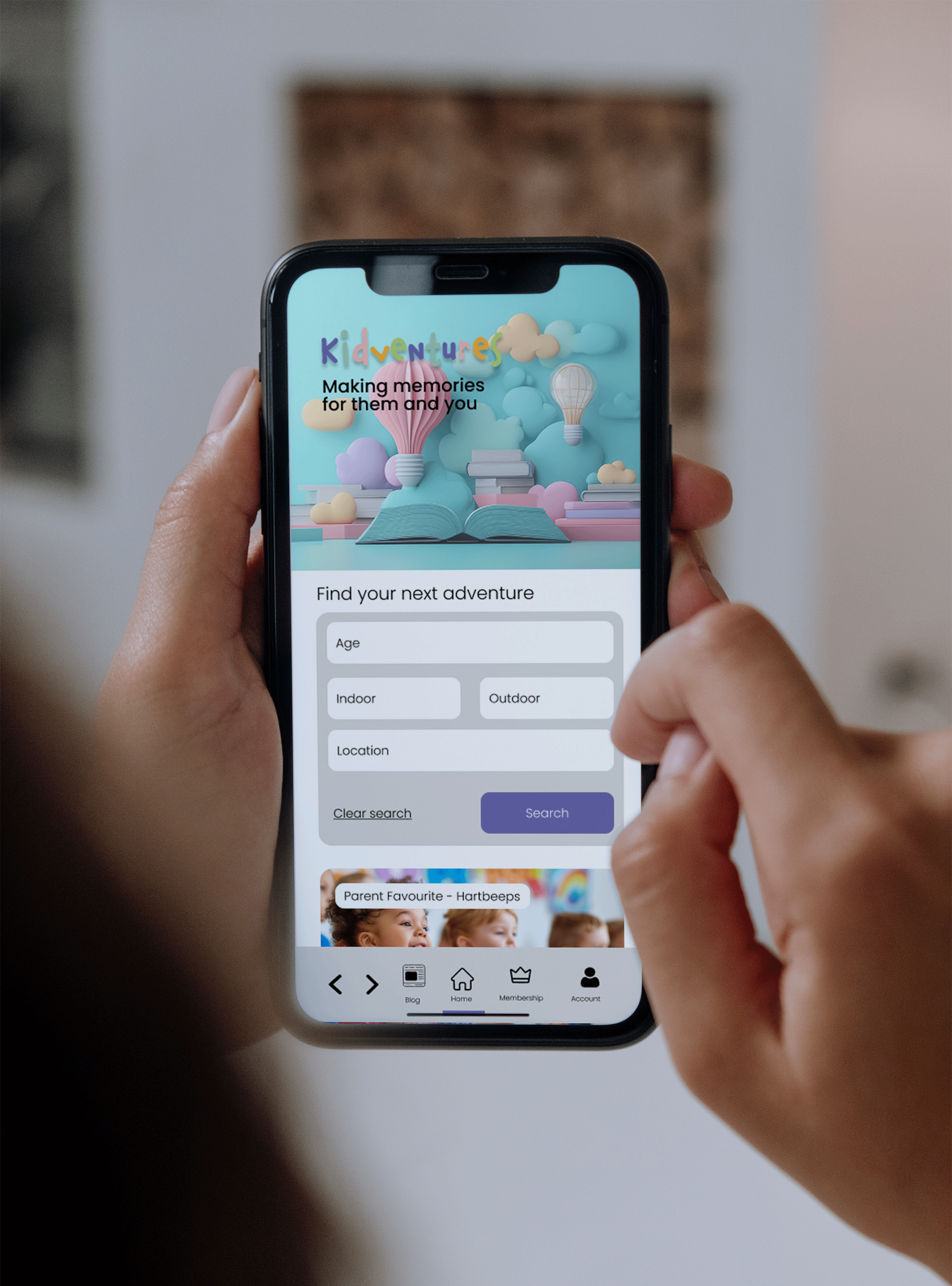
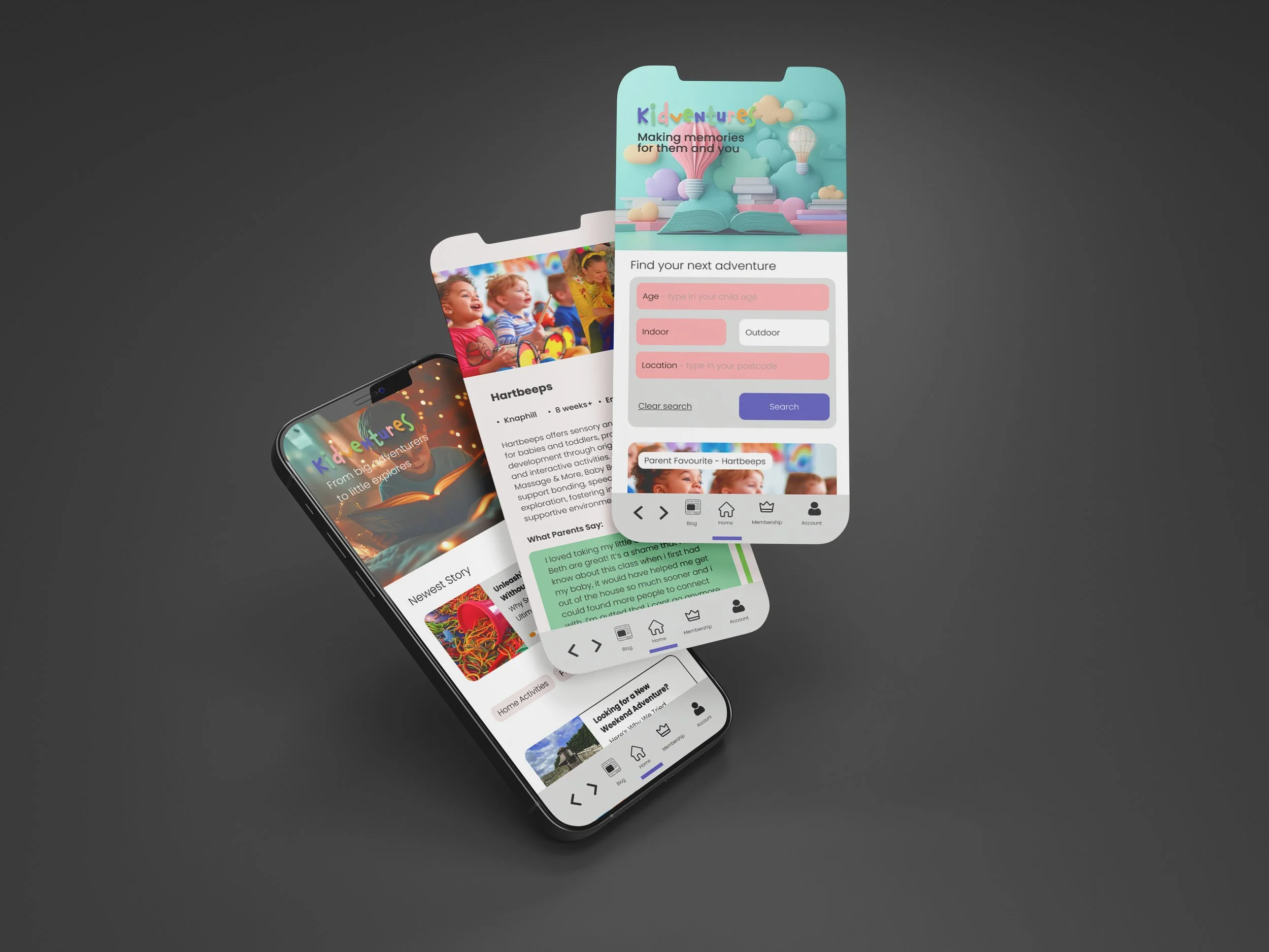
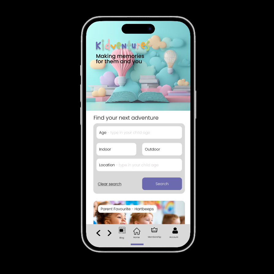
Kidadventures was designed to make decisions easier by structuring information around what parents actually need to know in the moment, not just what venues choose to show.
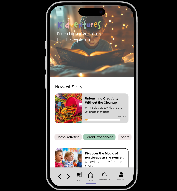
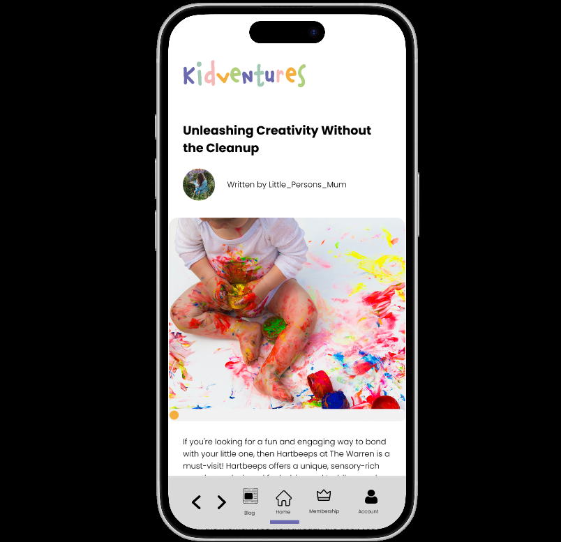
A working prototype of the platform has been created in Figma, showcasing the planned user journey and design functionality.
Designed around real decision-making
Prioritised the questions parents instinctively ask
Reduced the need to search across multiple sources
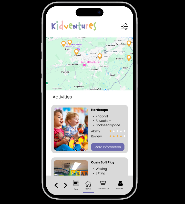
Made suitability immediately clear
Highlighted age appropriateness and ability levels
Addressed gaps where children don’t fit neatly into categories
Reduced environmental uncertainty
Included practical details often overlooked
Baby-changing facilities, buggy access, layout considerations
Simplified choice through structure
Organised information to reduce overwhelm
Created a clearer path from browsing to deciding