Neurodiversity: A Checkbox in Branding
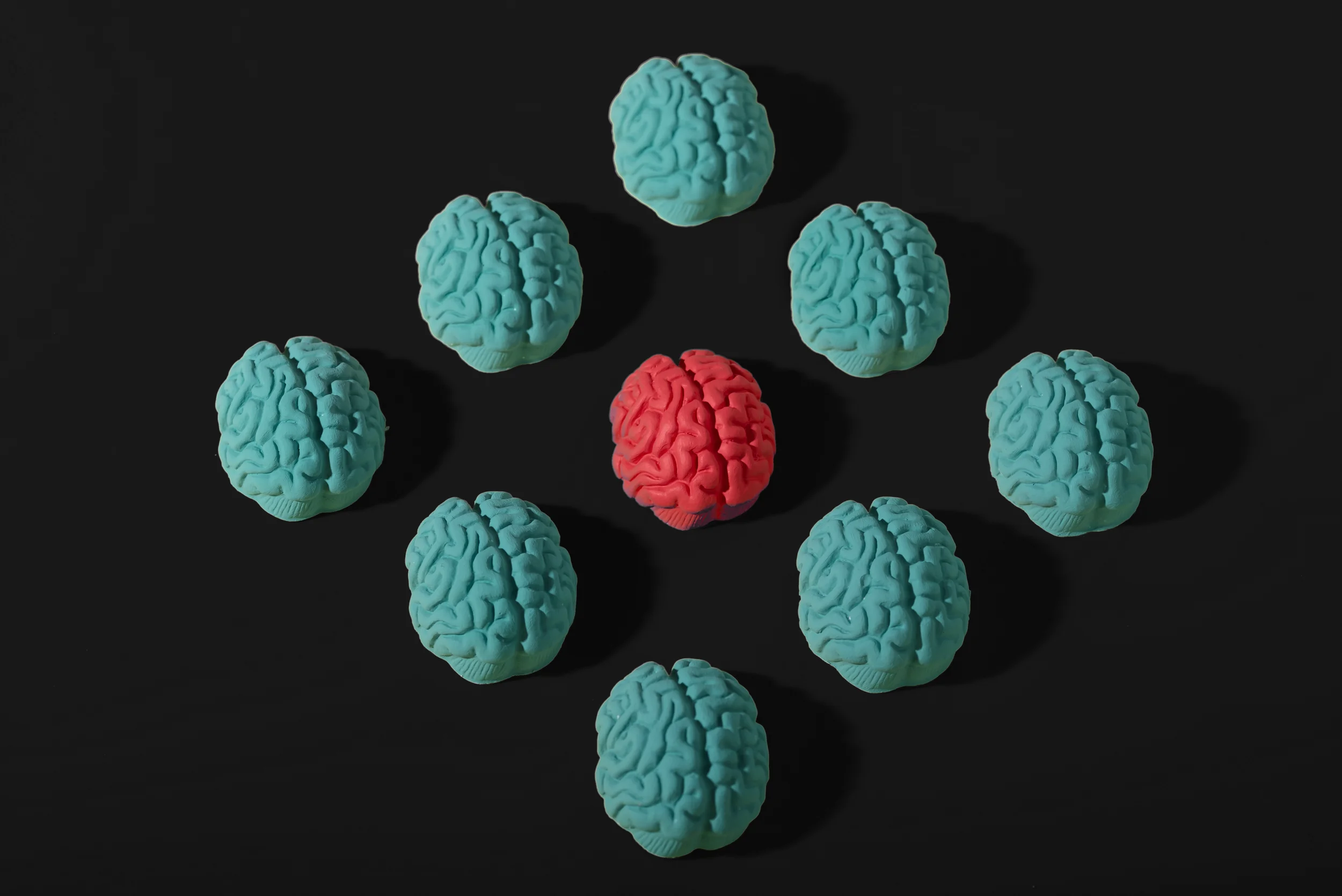
The image shows nine brains in a square, arranged in three rows of three. The middle brain is bright pink, and the rest are teal placed on a black background.
ADHD to autism, dyslexia to dyspraxia – neurodiversity is labelled, debated, and dismissed. A buzzword or trend that is overexposed and under-respected, seen as an excuse. I have been diagnosed with dyslexia since I was around six years old, and most recently, with ADHD. I resisted the idea of having ADHD as I didn’t fidget all the time —I’ll admit I didn’t know much of the symptoms, however, I always design my work thinking if I can understand it and see it without difficulty, then most of the users I was designing for would also. Right?
When I was diagnosed with ADHD, it explained A LOT about me I which I found a paradox. It gave me language for the way I think, work, and move through the world. Making it a little less lonely. On the other hand, it boxed me into a label I’d spent years ignoring.. That tension – between definition and individuality – is precisely why neurodiversity can’t just be an afterthought in branding.
The Checkbox Problem
Too often, brands treat neurodiversity like a line item—a checkbox to prove inclusivity, in a. corporate responsibility statement. A single accessibility tweak on a website —We’ve cracked it!
But the lived experience isn’t a bullet point on a PowerPoint report for C-level management. It’s messy, nuanced, and often contradictory. For neurodivergent users, a brand that claims inclusivity but designs for the “average” brain feels like being invited to dinner but left standing just shy of it, watching.. The message is: we see you, but we don’t really know how to seat you at the table.
And here’s the thing: accessibility isn’t just about adding alt text or writing image descriptions. Those are a start, not a finish line. Neurodiversity in design is also about:
Layout: Does the page overwhelm or guide the reader? Is there breathing space between elements?
Colour choices: Are palettes chosen with contrast and sensory comfort in mind, or are they just aesthetically pleasing?
Text use: Is the copy broken down, straightforward, and easy to digest – or are users drowning in walls of words? We see you newspapers!
These are decisions that either include people or shut them out. Determine whether or not they feel seen.
Why Neurodiversity Should Be at the Forefront
Neurodiversity isn’t a niche. It’s not a special case. At least 1 in 5 people process the world differently. Making it a core part of your audience and when brands centre neurodiversity:
Design becomes intuitive. Clear navigation, minimal overwhelm, and accessible content benefit everyone, not just those with ADHD, autism, or dyslexia.Increasing the user experience and the law of clarity.
Communication becomes human. Ditching jargon, long walls of text, or confusing instructions helps all users process information better. Again, think of the law of clarity and Nielsen’s Usability Heuristic.
Trust becomes stronger. Users can feel the difference between a brand that’s ticking boxes and one that has truly considered how their audience experiences the world. Hello, Jacob’s law – the importance of delivering a consistent experience across websites.
The Paradox of ADHD and Branding
ADHD has taught me something strange: I know exactly what I need to thrive – and I also know how often the world refuses to provide it. That paradox mirrors the user experience for many neurodivergent people.
We don’t need brands to “fix” us, acknowledge us. To design with us, not for us. To create systems that are flexible enough to hold multiple ways of thinking. The best thing is that it will also help your “normal brain” users because when brands lead with neurodiversity, they’re not just being inclusive – they’re being innovative. They’re creating products, services, and experiences that reflect reality, not a polished average that doesn’t exist. These are built into the foundation, not painted on the surface, and are inclusive by default.
Knowing this, brands should ask:
Have we considered cognitive accessibility as much as physical accessibility?
Do our layouts, colour choices, and content support focus – or overload it?
Are we building environments where difference is not just accepted, but expected
I always knew designing for neurodiversity should be a given. It was instinct for me long before I had the language for it. But if I’m honest, I never fully embraced that part of myself – I saw it as something shameful, something to hide.
The diagnosis changed that. It showed me that what I thought of as a flaw was actually a strength: a way of seeing the cracks in systems most people overlook. And that’s why neurodiversity can’t be an afterthought in branding. It’s not about shame, pity, or checkboxes. It’s about designing in a way that finally reflects the world as it actually is.
